BRA Cookware
Amazon Storefront · Store Builder · UI/UX · Ecommerce · Shopify
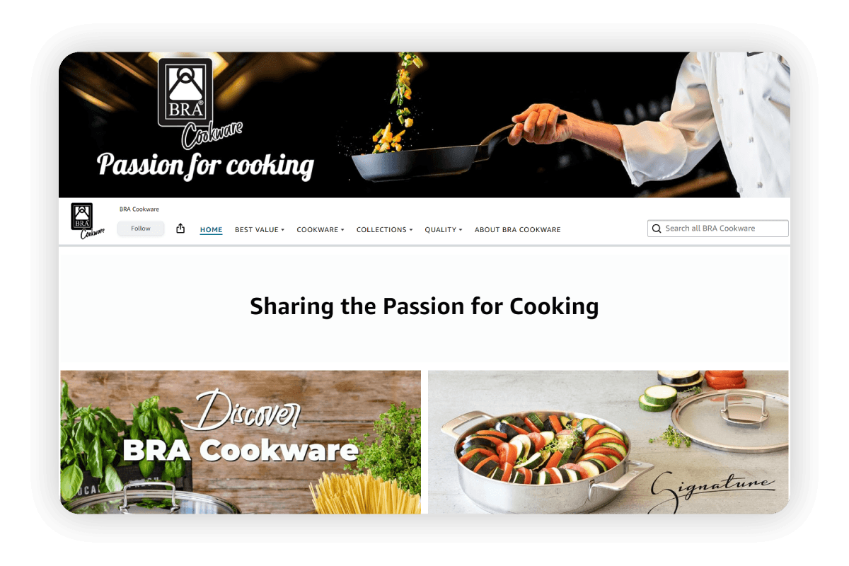
BRA Cookware
BRA Cookware is a Spanish cookware brand with decades of history, designed in Barcelona and distributed globally. The project involved redesigning and optimizing their Amazon presence (the Amazon Storefront built with Store Builder, the channel where most of the brand's sales are concentrated according to information shared by the client) and aligning that experience with the official Shopify site.
The work covered the audit of the existing Storefront, the reorganization of the collection architecture, the visual redesign within Store Builder's constraints, the conversion page strategy (Best Value, bundles), and the visual consistency with bracookware.com. Everything was delivered in approximately 3 weeks.
Project Stages
"A premium brand with six distinct collections, compressed into a platform that wasn't designed to tell brand stories."
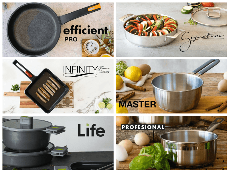
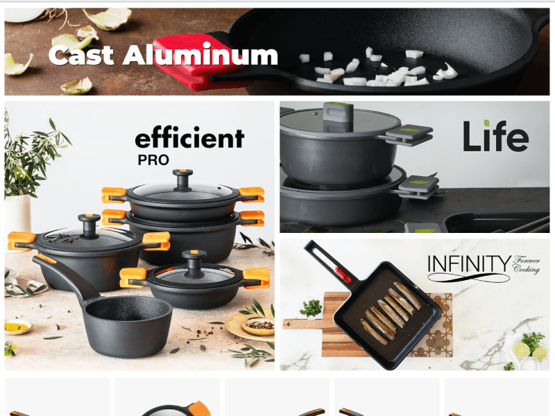
Amazon Store Builder is a powerful tool but with clear constraints: predefined modules, limited control over layout, and no real control over typographic hierarchy. BRA Cookware has a catalog with highly differentiated collections (Cast Aluminum, Signature in 18/10 stainless steel, Efficient Pro, Infinity, Life) that needed a navigation architecture guiding shoppers toward the right product based on their cooking style and level of demand.
The challenge was making the Storefront communicate that brand logic within Amazon's constraints, and replicating that same logic coherently on the Shopify site.
How I
built it
A five-stage process that started from diagnosing what already existed and ended with two channels aligned under one visual system.
Audit of the existing Storefront
Full review of the page structure, navigation between collections, and visual hierarchy of the previous state. Three main problems were identified: no entry page contextualizing the collections, mixed navigation logic (by product type and by collection simultaneously), and lack of visual alignment with the brand system.
Collection architecture definition
Redesign of the page map with a clear logic: Home as a distributor, pages by material line (Cast Aluminum, Stainless Steel), pages by specific collection (Efficient Pro, Infinity, Life, Signature, Master, Professional), and dedicated conversion pages (Best Value, bundles by budget). The axis was that shoppers could navigate either by material or by collection without getting lost.
Visual design within Store Builder's constraints
Configuration of all available modules in Store Builder to maximize visual impact: collection hero banners with product photography, editorial tiles highlighting technical differentiators (full induction, 18/10 steel, certifications), and "more for less" sections to anchor value perception. Each collection page followed the same visual pattern to generate consistency throughout the Storefront.
Conversion page strategy
Design and configuration of the Best Value page as an entry point for price-oriented shoppers, with bundles hierarchized by investment range (Compac 5-piece, Premiere & Infinity, Treviso & Infinity). The goal was to capture shoppers arriving without a defined collection in mind and guide them toward a higher average order value.
Alignment with bracookware.com (Shopify)
Review of collection naming, visual system, and navigation structure on the Shopify site to ensure cross-channel consistency. A shopper alternating between Amazon and the owned site should find the same collection logic, the same names, and the same visual language, with no friction between platforms.
Tools & Stack
Amazon Store Builder as the primary platform, with Figma for asset design and Shopify as the second channel to align.

Amazon Storefront: home page with collection distribution
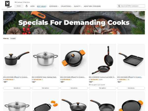
Best Value page with bundles by investment range
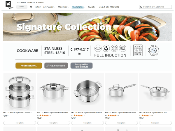
Signature Collection in 18/10 stainless steel, full induction
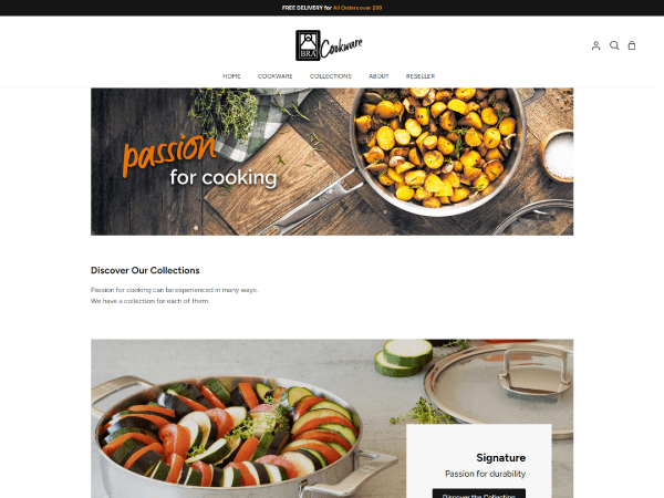
bracookware.com with visual alignment to the Storefront
Design Decisions
The three decisions that most defined the Storefront's final experience and its impact on conversion.
Dual navigation: by material and by collection
BRA has shoppers searching for "non-stick pan" and others searching for "Efficient Pro." I designed a structure that allows entry by material (Cast Aluminum, Stainless Steel) or directly by collection, without either flow interrupting the other. That resolved the navigation chaos of the previous version and shortened the path to the right product.
Best Value as a capture page, not a clearance section
Instead of treating the Best Value page as a discount section, I designed it as an entry point for undecided shoppers. Each bundle was hierarchized by investment level with a clear value justification (what's included, why it's worth it). The goal was to increase average order value by capturing shoppers before they chose just a single individual product.
Product photography as the only non-negotiable element
In Store Builder there's very little control over typography and layout. The decision was to invest all visual effort in the quality and consistency of image assets: collection banners with the same palette, same lighting style, and same framing. That generated visual unity without depending on resources the platform doesn't allow you to modify.
What I
learned
Designing within Amazon's constraints forces you to be more strategic with every decision than you would be on an owned platform.
Platform constraints are a design brief in disguise
Store Builder doesn't let you control margins, fonts, or typographic hierarchy. That forced brand communication to be solved almost exclusively through images and page structure. The result was a more disciplined visual system than many sites with total creative freedom: when you can't decorate, you have to be clear.
Navigation architecture matters more than any banner
In a Storefront with six collections and multiple product types, the biggest friction wasn't visual but structural. Shoppers didn't know which collection was theirs because there was no clear entry system. Fixing the architecture before touching any asset was the decision that changed the experience the most.
Two incoherent channels are worse than one well-executed channel
BRA had a Shopify site and an Amazon Storefront using different names for the same collections. Aligning both channels wasn't an aesthetic detail but a business decision. A shopper who researched on Amazon and bought on the owned site needed to find the same brand, with the same names, without having to relearn the product logic.