Taskflow
Conversion Landing Page · B2B SaaS · UI/UX · Copywriting
Concept project · Fictional brand · Diagnosis and build exercise. Visit site →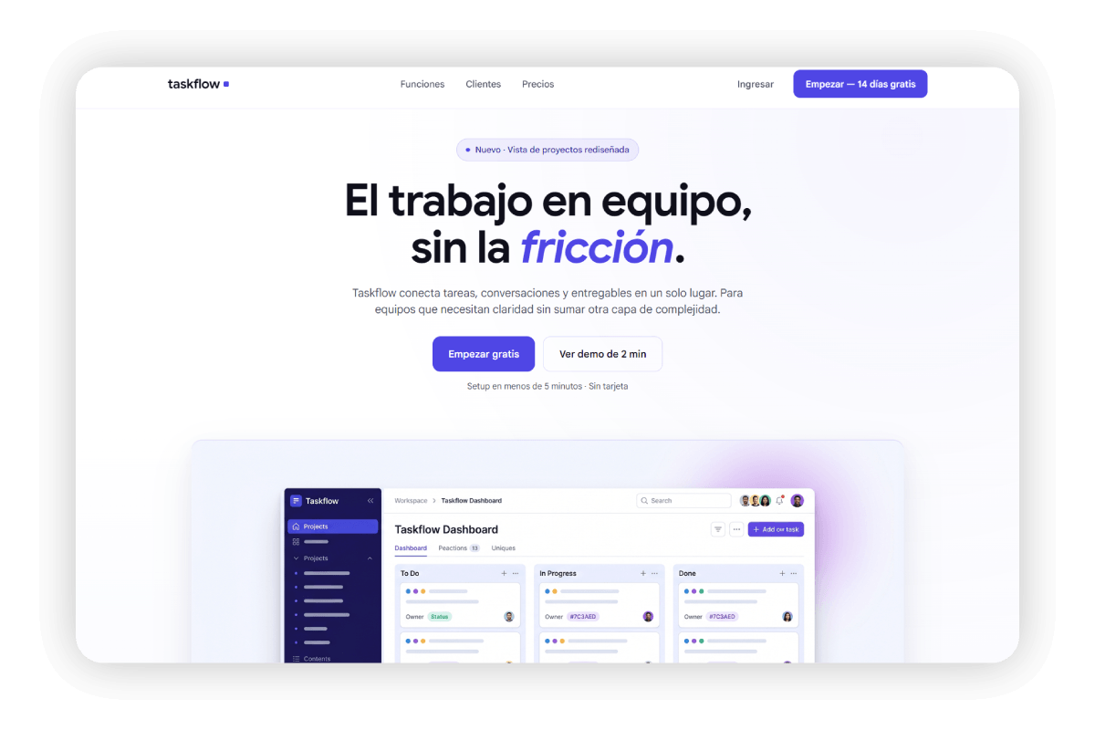
Taskflow
Taskflow is a portfolio concept project: a SaaS project management tool for small teams, with real traction but a landing page that failed to communicate its value within the first 5 seconds. The work involved diagnosing the conversion problem, redesigning the message hierarchy, and building the full landing from scratch, with the visual system, copy, and responsive included.
The design was developed in Figma, the code in pure HTML/CSS/JS, using Claude Code to structure the component flow and ChatGPT to iterate copy alternatives before locking in the final direction.
Project Phases
"Traffic was coming in. Conversion wasn't. The problem wasn't in the design. It was in the order of the message."
The scenario is a product with traction and a landing page that fails to communicate its value in the first five seconds. A case where changing the CTA, moving the form or adding testimonials solves nothing, because the problem comes earlier: the visitor decides to leave before reaching the CTA.
The cold analysis was blunt: within the first 5 seconds, a visitor could see a product screenshot, a generic headline and a button. What they couldn't see was what the product did, who it was for, or why it was different from the 40 competitors in the same category. The value proposition was three scrolls down. Most visitors never got there.
How I
built it
A process that prioritized diagnosis over solution, and message structure over visual design.
Cold landing analysis
I reviewed the original landing without any prior context, timing exactly what information was visible before the first scroll. In 5 seconds: product screenshot, generic headline, CTA button. The differentiating value proposition didn't appear until the second section. The visitor had to work to understand what was being offered.
Rewriting the headline from the user's problem
The original headline described the product. I replaced it with one that names the specific problem it solves: "Teamwork, without the friction." I used ChatGPT to generate and compare over 20 variants before locking in the final direction, including an aspirational headline and a product-name-first headline, both of which we ruled out.
Building the visual system in Figma
Built the palette from scratch: indigo (#4F46E5) as primary accent with a gradient toward violet (#7C3AED), white background with very soft gray variants for alternate sections. The type system uses Google Sans across all weights. I defined all base components before designing any complete section.
Splitting the two CTAs by intent
The original landing had a single CTA: "Start for free." The cold visitor isn't ready to start: they're still trying to understand. I designed a secondary CTA ("See how it works") that keeps the evaluating visitor on the page without forcing a premature decision. The limit is two: more CTAs cause decision paralysis.
Building the sticky-scroll section with Claude Code
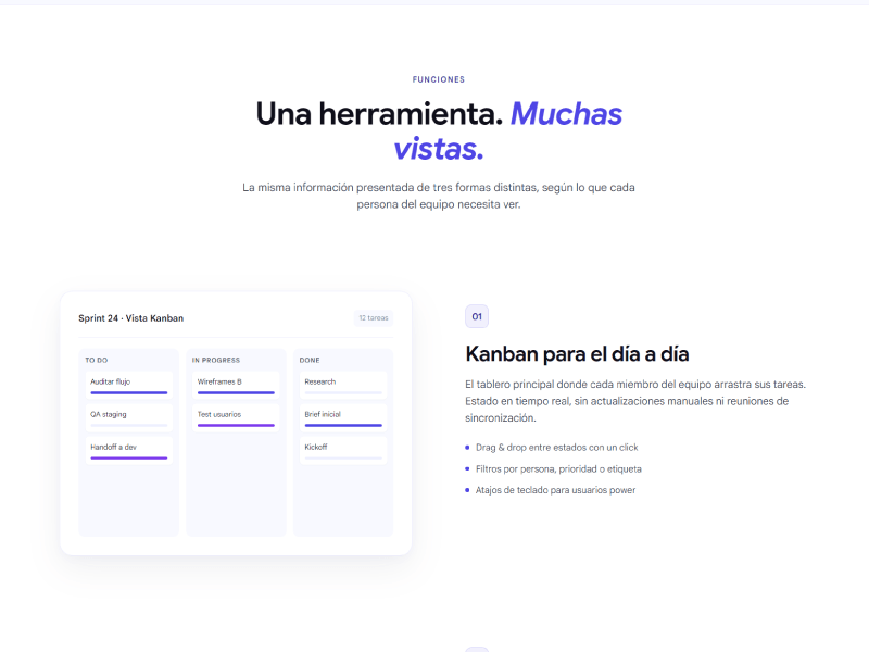
The features section was the most technically complex piece: a visual panel on the left that changes state (Kanban → Timeline → Reports) based on scroll position on the right. I used Claude Code to structure the Intersection Observer logic and manage active states without relying on jQuery or external libraries.
Responsive as a separate design phase
Responsive wasn't a final adjustment but a complete redesign phase. Mobile and desktop have entirely different layout logic in key sections (hero with cropped image, sticky-scroll converted to a simple list, featured pricing card with order -1). Each breakpoint has its own reading intent.
Tools & Stack
Pure HTML/CSS/JS as the development base, Figma for the visual system, and two AI tools as active working instruments throughout the process.

Full landing page in desktop version
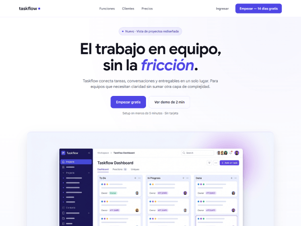
Hero: headline, sub and dual CTA
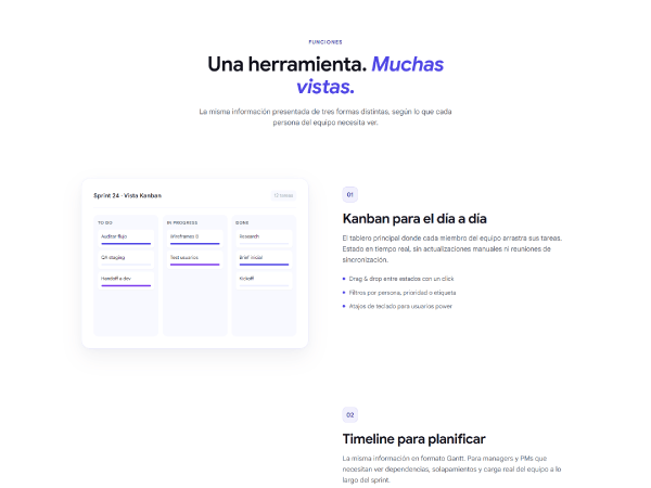
Sticky-scroll features with the Kanban state active
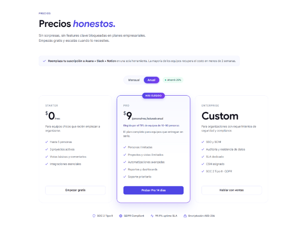
Pricing section and closing CTA
Design Decisions
The three choices that had the most impact on the final outcome, and the alternatives that were ruled out along the way.
Headline written from the user's problem, not from the product
The original headline described the product: generic, no immediate identification. I replaced it with one that names the friction the visitor already knows before they know what Taskflow is. That inversion made visitors recognize themselves before evaluating the solution, which shortened the path to the CTA.
Dual CTA with differentiated intent
A single sign-up CTA assumes all visitors are equally ready to decide. The hot visitor converts with "Start for free." The cold visitor needs more context, so the secondary CTA ("See how it works") keeps them on the page without forcing a premature decision. Two CTAs in the hero don't compete: they complement each other.
Native sticky-scroll with no external libraries
The features section required a visual panel that changed state based on scroll progress. I chose native Intersection Observer over GSAP ScrollTrigger or similar libraries: lower load weight, lower risk of cross-browser conflicts, and more readable code to maintain. The visual result is identical with a tenth of the overhead.
What I
learned
A conversion project teaches more about message and behavior than about visual design.
Before redesigning, you need to re-diagnose
A conversion problem can originate in the message, the visual hierarchy, the form friction, or a mismatch between traffic and the proposition. In this project, the team had tried three CTA changes without moving the needle because the problem came before the CTA: visitors had already decided to leave before reaching it. Redesigning without re-diagnosing produces a prettier landing with the same conversion rate.
Claude Code and ChatGPT as process tools, not replacements
Claude Code was useful for structuring the Intersection Observer logic and managing sticky-scroll states, tasks where a syntax error is costly and the correction cycle is slow. ChatGPT helped generate copy variants in parallel for comparison before deciding. Neither replaced design judgment: what they accelerated was the time between hypothesis and test.
Responsive on a conversion landing is a redesign, not a tweak
The mobile version can't just be the desktop shrunk down. In this project, the sticky-scroll that worked perfectly on desktop became a simple list on mobile, because trying to preserve the interaction on a small screen would have generated more friction than the product promised to eliminate. Every breakpoint needs its own reading intent.