Nueva Vida
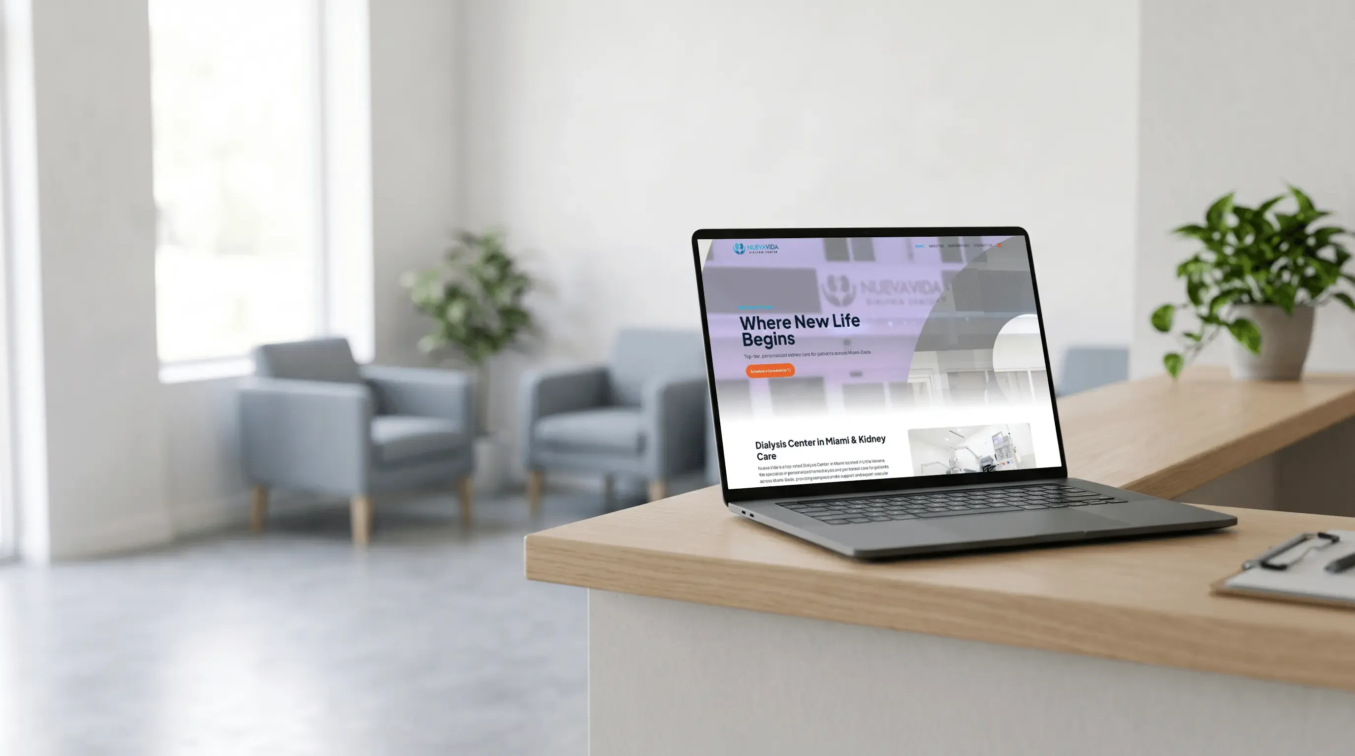
Nueva Vida is a dialysis center in Miami. It had no website: patients could only reach it on WhatsApp. The brief was a site with the look of its social networks and a way to send messages from the platform. I worked directly with the client. I designed, built and handled the SEO; I did not write the content.
According to the client, they were satisfied with the final design.
- Month on the project
- 1
- Pages in total
- 8
- Languages, 4 pages each
- 2
The problem
Little content, and a site patients had to find easily through SEO and GEO.
There was no site before. The only contact with the client was WhatsApp, and patients had no other way to write. The brand had little content, so each page had to organize it well for a patient to arrive through search engines and LLMs. The brief set the starting point: the look of its social networks, now on the web.
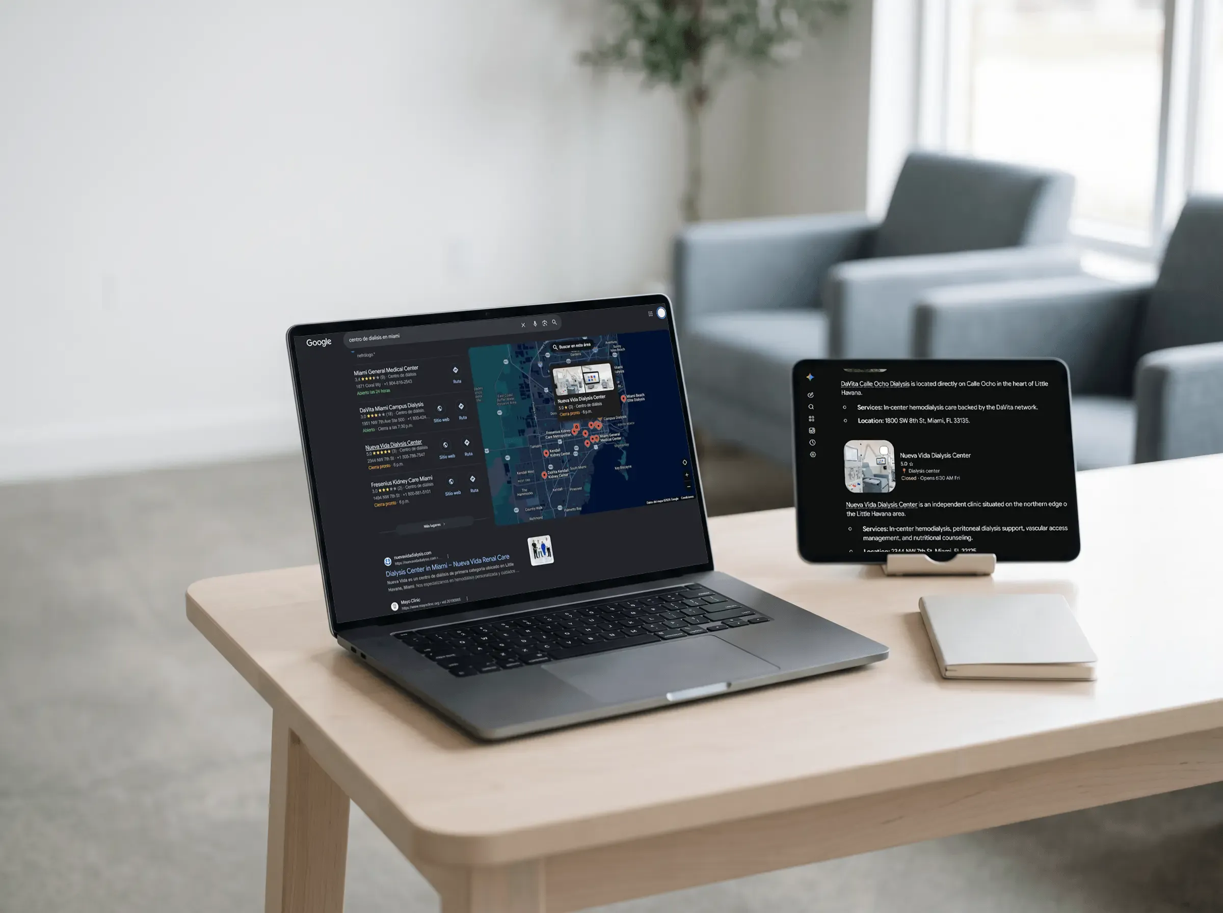
A basic search leads to the center.
On Google it appears first on the map and in the results for "centro de dialisis en miami"; Gemini lists it with its services and address.
The home introduces the center and leads to a consultation.
The consultation button opens the hero and returns in the closing band, with the accreditation, four reasons and the services between them.
What I did
01
Home page
I designed the home page in Figma with the visual style of Nueva Vida's social networks.
02
Mockup
I turned the design into code so the client could review a working mockup.
03
Revisions
I applied the client's changes on that mockup until the design was final.
04
Divi
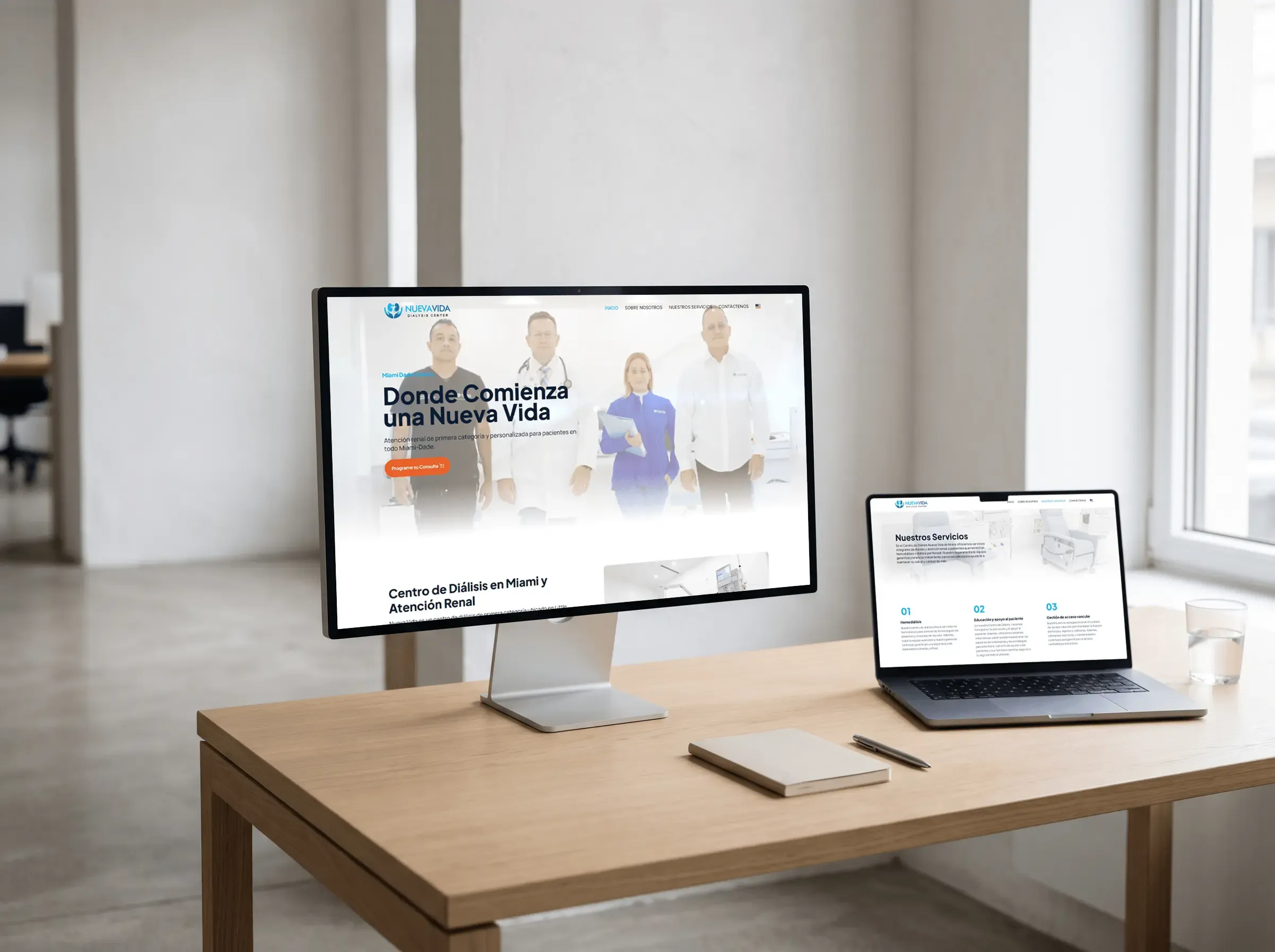
I moved the final design to WordPress with Divi Builder: Home, About Us, Our Services and Contact Us, in Spanish and English, with the message form on Contact Us.
05
SEO and GEO
I worked on SEO and GEO with keywords, so a patient running a basic search like "dialysis center in Miami" could find the center. The site's title on Google and the home page heading repeat that phrase.
Site architecture
Home
Pages
- About Us
- Our Services
- Contact Us (message form)
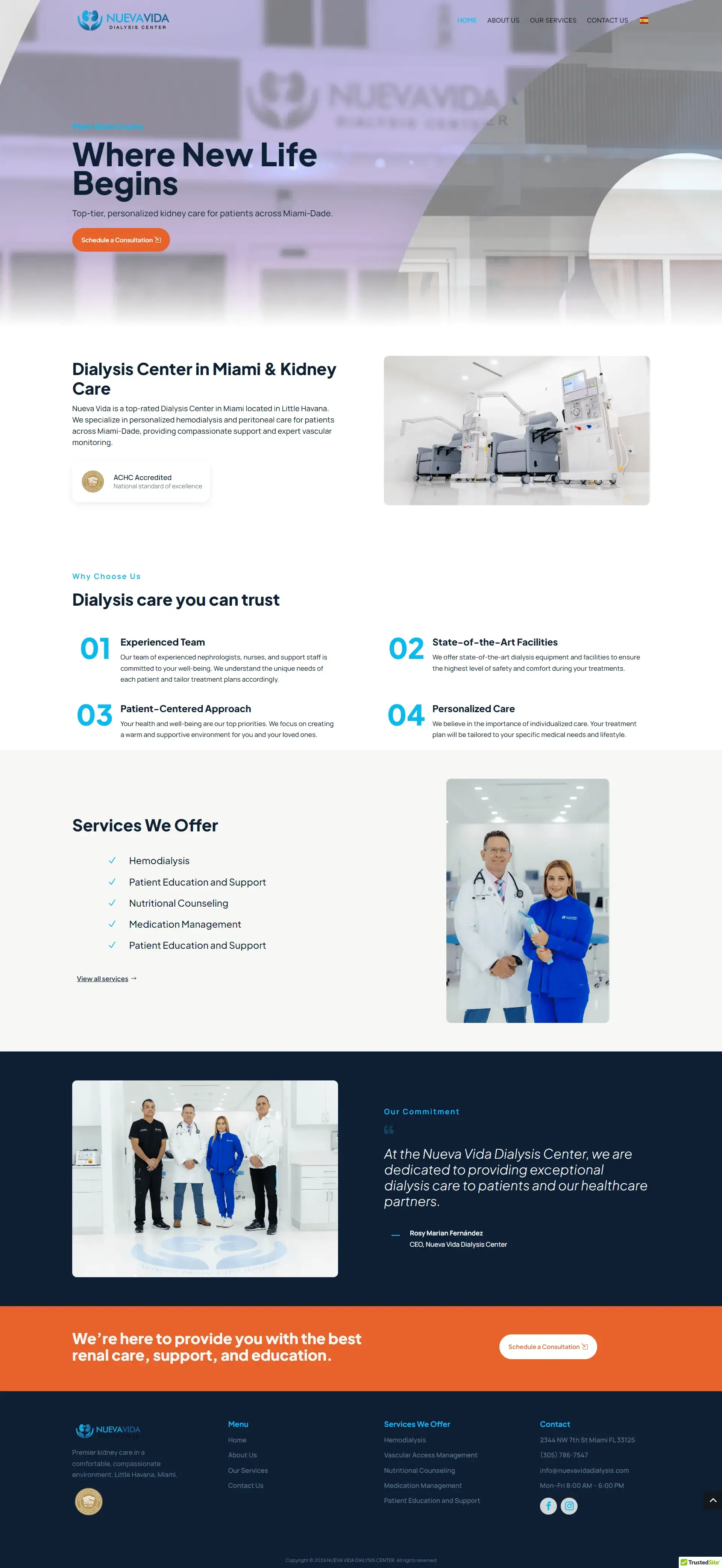
The home page, top to bottom.
Hero with the team, intro, four reasons, services, the CEO's quote and a closing consultation band.
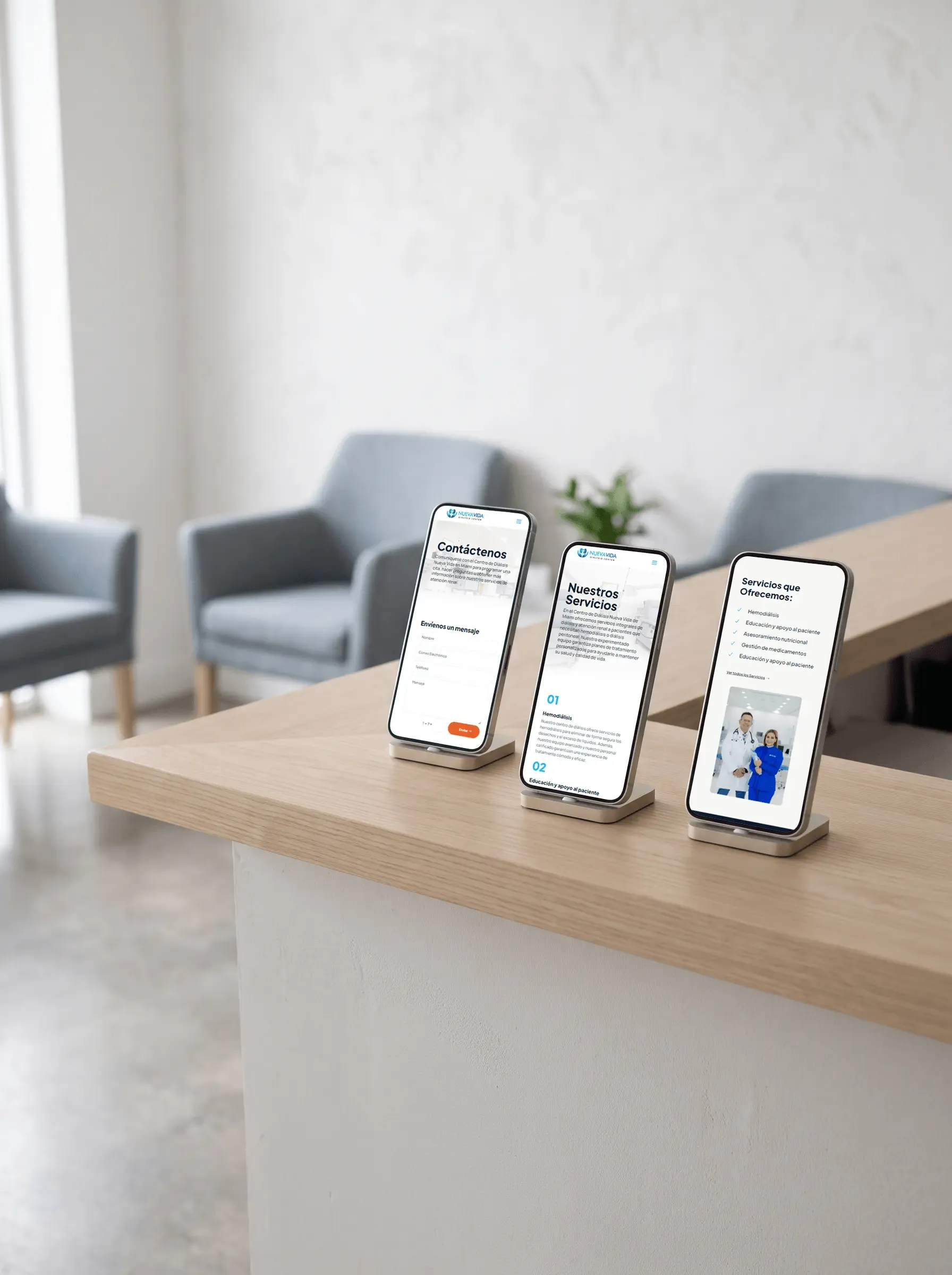
The same path on the phone.
Home, Services and Contact in a single column, with the consultation button in view.
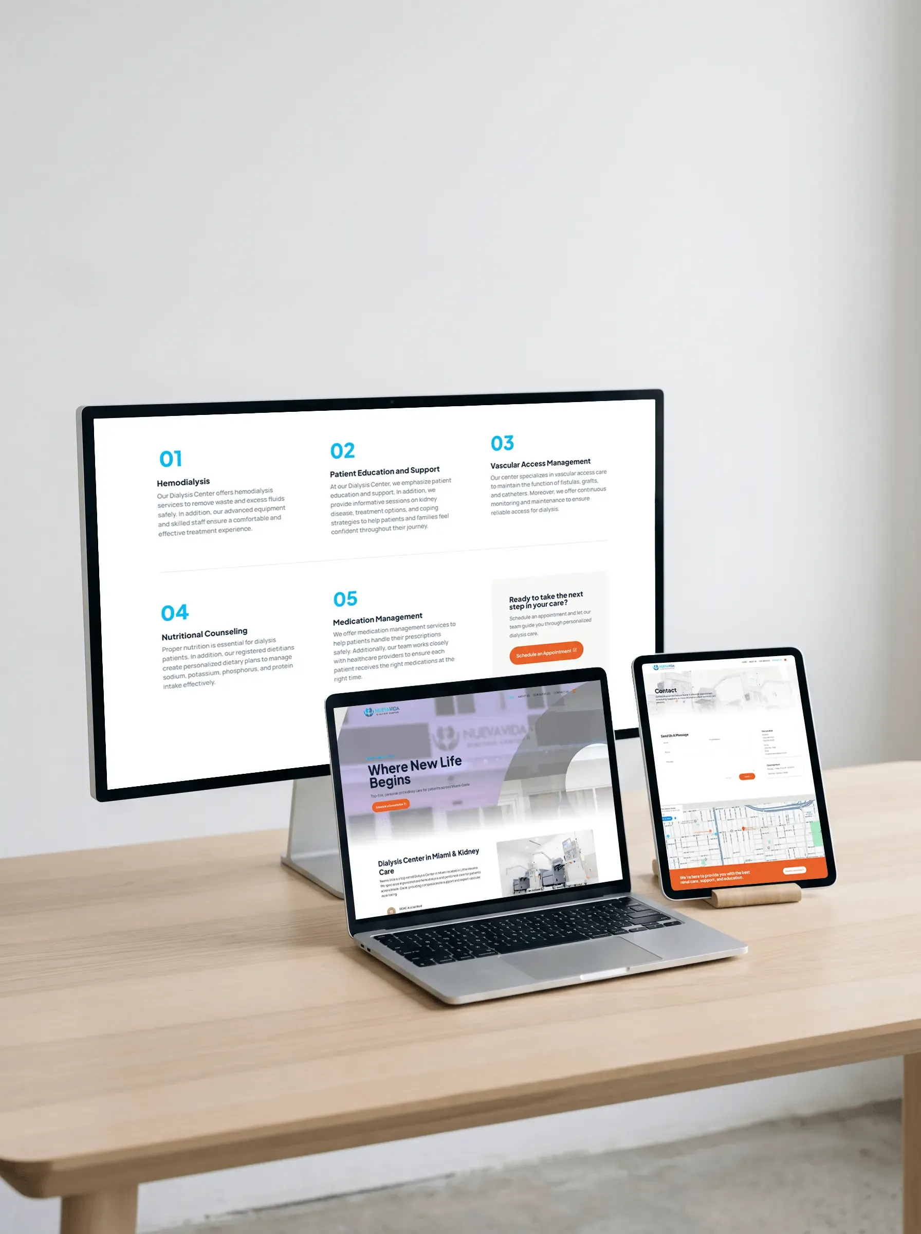
Detail at component scale.
Four numbered reasons · Services with an appointment card · Form and location
Visual system
Primary
#09BAEE
Background
#FFFFFF
Primary text and secondary background
#0D1F35
Accent
#E8612A
Secondary gray background
#F7F7F5
Typefaces
Plus Jakarta Sans
Headings
Manrope
Body
What I take away
Visibility without much content
I learned that with well-chosen keywords and a basic grasp of visibility, a new site can show up on Google and in LLMs without relying on a lot of content.