BRA Cookware
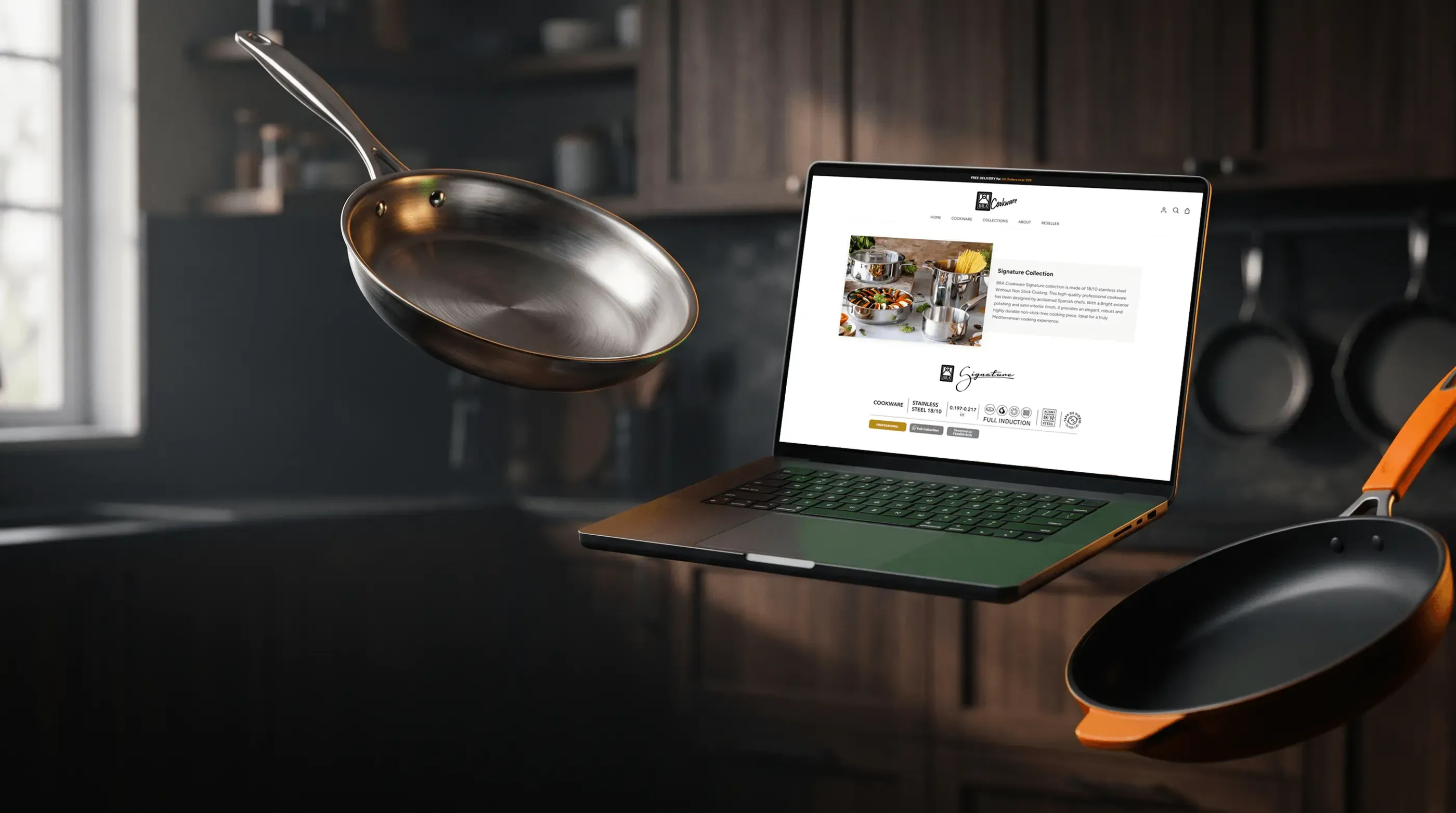
BRA Cookware was already selling in Spain, with a local Shopify store and Amazon Store. The project was a Go to Market: ship the products to the United States and sell them there. I redesigned both stores for that shopper, working with the client’s creative team and Soyculto’s in-house team.
The client was always happy with how their images were handled. What mattered most was not losing the soul of a premium European product when adapting it for the US. The store is still live, although a few months ago I left the agency that runs it.
- Years on the project
- 3
- Channels, Shopify and Amazon
- 2
- Collections with A+ content and images
- 9
- Of Amazon conversions came through the Storefront, per Amazon Brand Analytics
- 70%
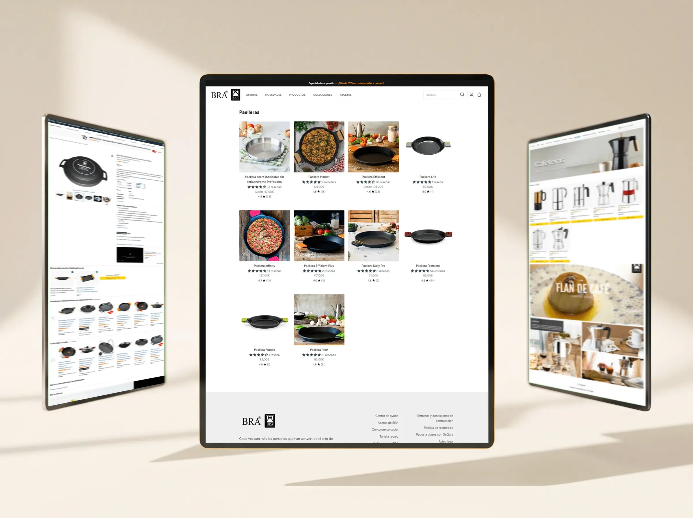
The problem
A premium brand established in Spain enters the US market with little visual content, all of it made for Europe.
The Spanish store worked. The jump was the problem: a crowded market, a different shopper and client material that was scarce and made for Europe. American shoppers would judge the brand by its images, and that material wasn't enough.
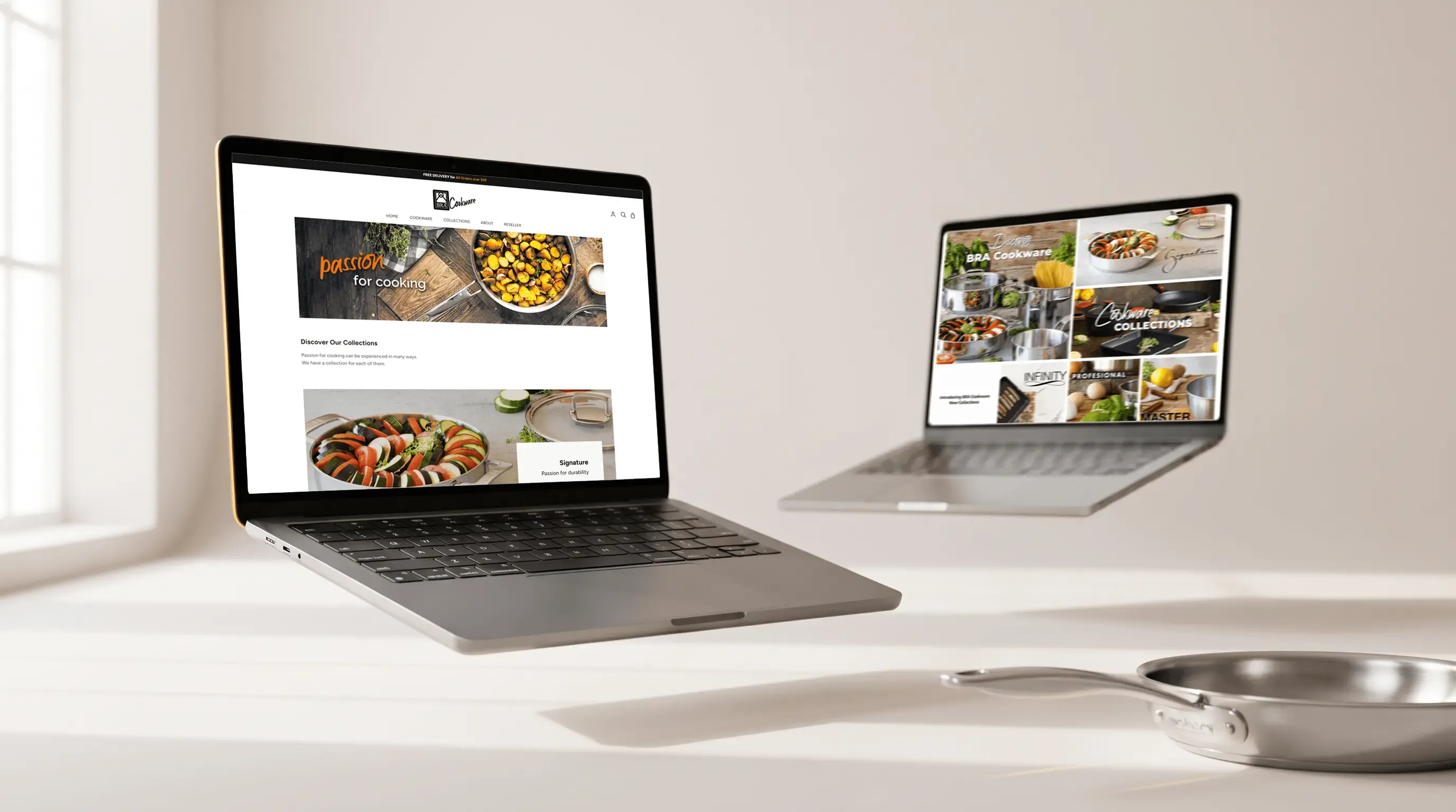
Two stores, one brand.
Shopify and the Amazon Storefront show the collections with the same photography.
What I did
01
Competition
I studied the competition in the US market before touching a single page.
02
Client material
I took every photo the client sent and edited it for each section and page.
03
Adaptation
I adapted the visual content for US shoppers without losing the brand's European essence.
04
Assets with AI
I generated assets with Nano Banana and edited them in Photoshop and Illustrator.
05
Amazon
I designed the Storefront pages and the A+ modules with their images for the 9 collections: Profesional, Premiere, Efficient Pro, Signature, Master, Infinity, Foodie, Life and Efficient Iron.
06
Shopify
The store started from the Spanish content and was rebuilt in English: copy, images and blocks, all new.
07
Campaigns
I created the campaigns for the key US dates: Labor Day, Black Friday, Amazon Prime Day, Prime Big Deal Days, Cyber Monday and 4th of July. Ads were renewed every month and their images featured the products of the month.
Architecture of both stores
Home
Shopify · Cookware
- Frying Pans
- Casseroles
- Specialty Cookware
Shopify · Collections
- Non-Stick Aluminum
- Stainless Steel
- Cast Iron
Shopify · Pages
- About
- Reseller
Amazon · Cookware
- Dual Pans
- Wok & Paella
- Pan Sets
- Frying Pans
- Cookware Sets
- Stock Pots
- Grills & Hot Plates
- Sauce Pans
- Sauté Pan
Amazon · Collections
- Profesional
- Premiere
- Efficient Pro
- Signature
- Master
- Infinity
- Efficient Iron
- Life
- Foodie
- Efficient Inox
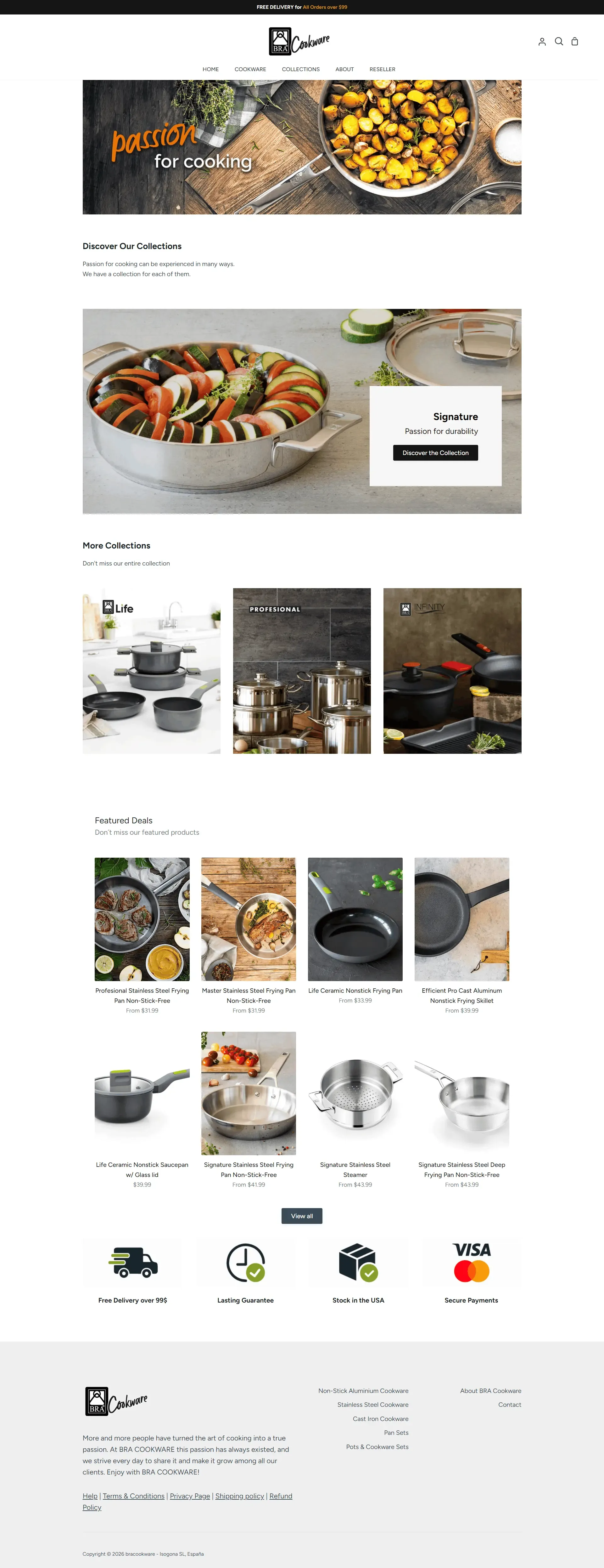
The Shopify home, top to bottom.
Hero, featured collection, three collections and products, closed by shipping, warranty and US stock.
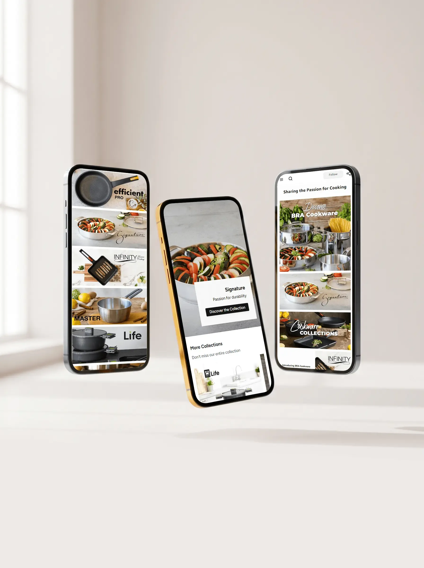
Phone first.
The Amazon Storefront built for the screen where traffic and conversions arrive, per Brand Analytics and Shopify analytics.
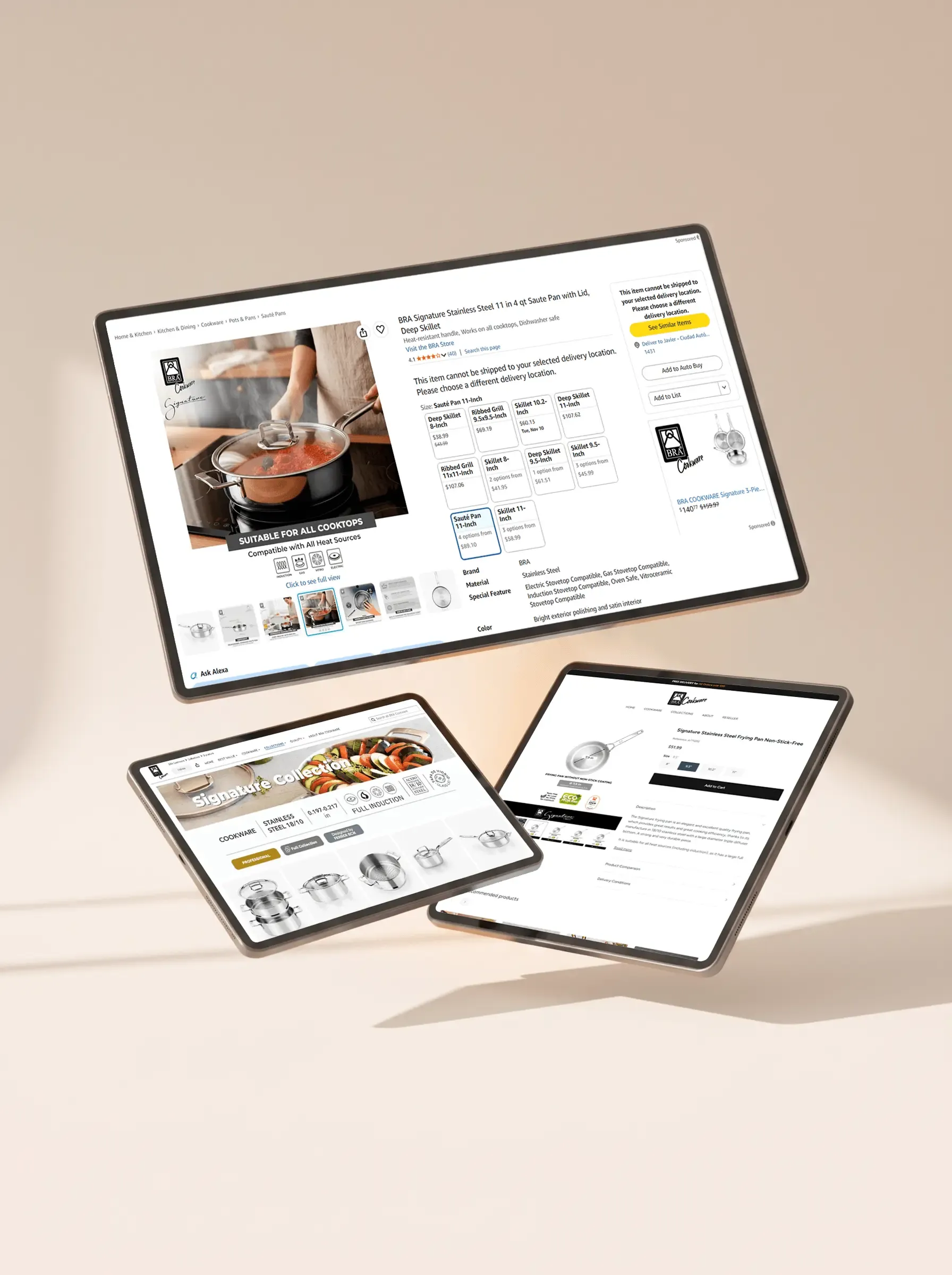
Detail at component scale.
Collection tile · Product image with measurements · Signature A+ module
Visual system
Black
#000000
Orange
#F16A00
White
#FFFFFF
Light gray
#EEEEEE
Typefaces
Brotherhood-modf, Montserrat Black
Amazon · Headings
Montserrat Regular
Amazon · Body
Figtree Bold
Shopify · Headings
Figtree Regular
Shopify · Body
Decisions
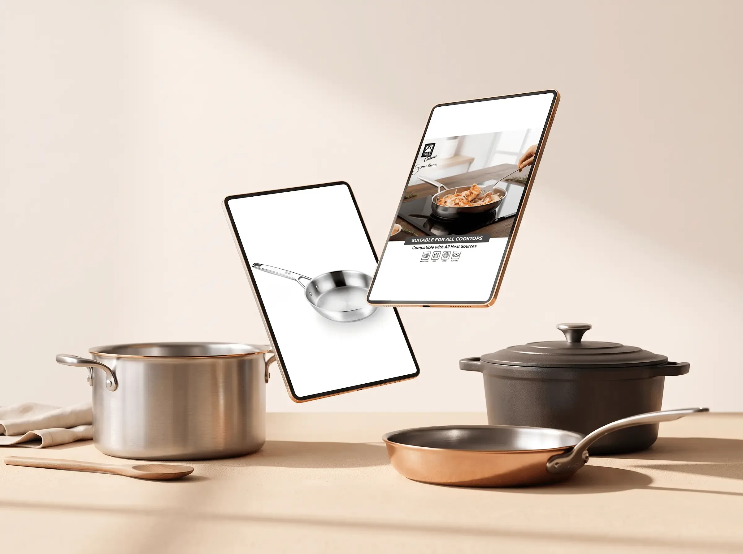
Imagery / Visual system
Working the client's images with AI
I took the client's assets and worked them with AI. The content was scarce and European, and the US market is crowded. I aimed for the product to look premium to that shopper while the brand kept its essence.
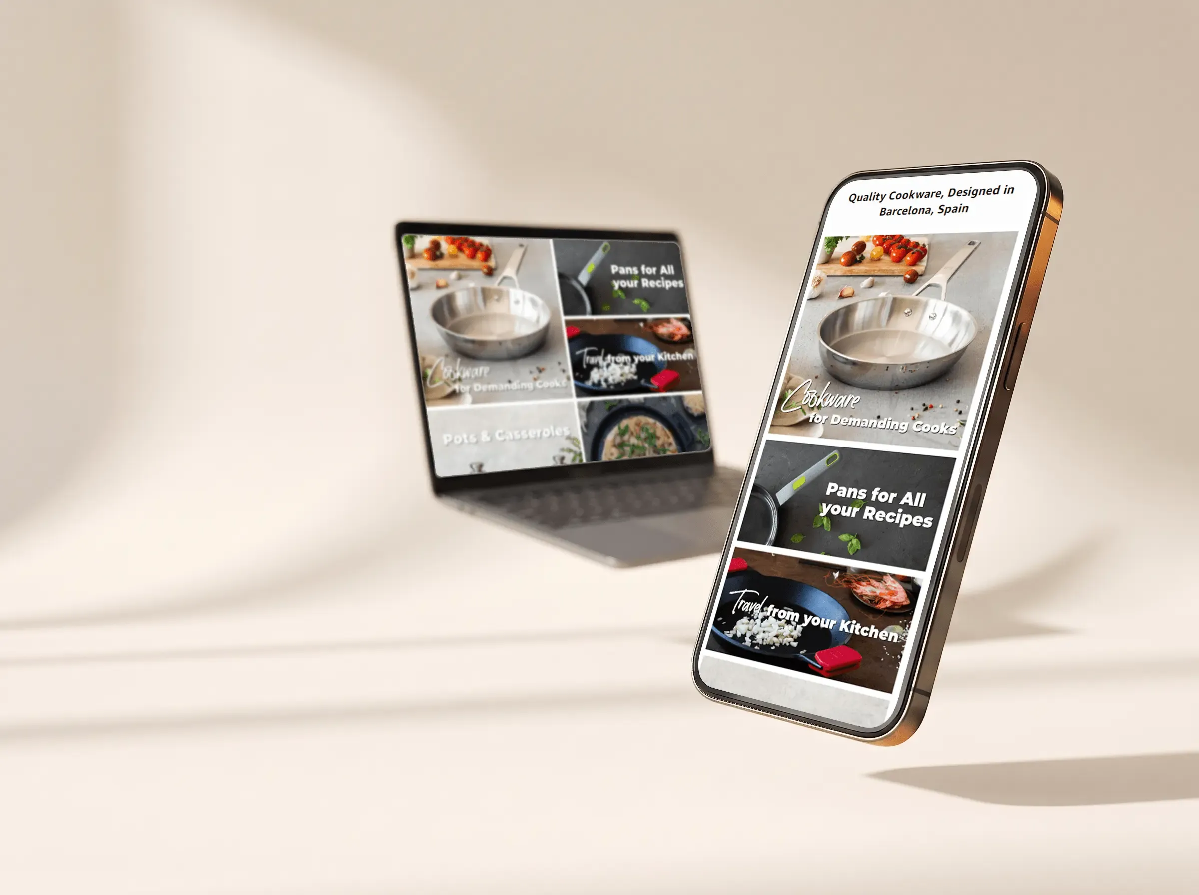
UX / Mobile
Designing mobile first
I designed the mobile view first and desktop second. According to Amazon Brand Analytics and Shopify analytics, most traffic and conversions came from phones. I aimed for the purchase to feel effortless on that screen.

Performance / Conversion
Light loads on the way to checkout
I prepared every image and load so the site wouldn't load slowly. I aimed for nothing to slow shoppers down on the way to purchase.
Takeaway
Two platforms, one client
I learned to work with two major platforms for the same client without one cannibalizing the other's traffic.
A big market
I learned to understand a market as vast and important as North America.